Film Magazines
As our film is predominately British, we as a group thought it would be relevant to have a film magazine company who has successfully advertised British films to advertise our film on the front cover of their magazine. The two we looked at were Empire and Total FILM but when researching further into the main types of films they exhibit on the front cover, it consisted of films which are well known as alarge budget was used to produce the film as well as feature big stars (actors) therefore appealing to a mass audience.
Titles
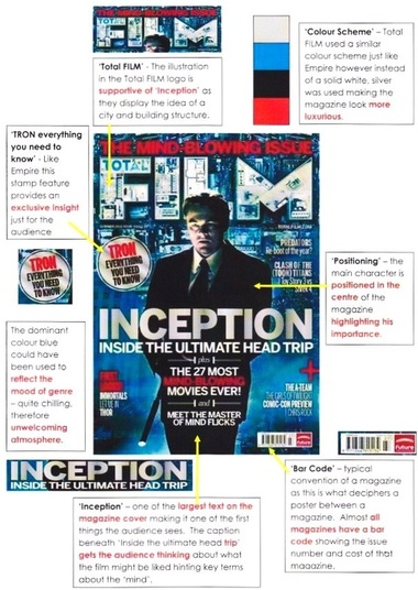
As shown by these images of actual magazine covers from both Empire and Total FILM, the masthead is altered to fit the theme of the film. The techniques illustrated on all four magazine covers tie in well with the rest of the magazine as it shows how the masthead is apart of the film.
Hell Boy 2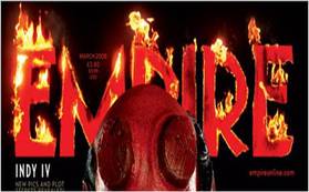
Empire had stuck to the original colour of text (red) for 'Hell Boy 2' also including fire to elaborators on a strong part of the film title, 'Hell'.
The Dark Knight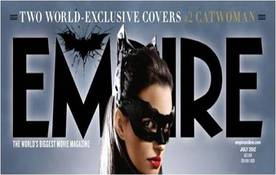
For 'The Dark Knight' the iconic image of the silhouttee of the bat is used to represent the movie. In order for a symbol such as this to be effective, the symbol itself must be well recognised throughout (Teaser Trailer, Poster and Magazine) allowing a immediate association to be made. For this symbol previous fans of 'The Dark Knight's' associate the silhouttee bat symbol with 'Batman'.
|
The Social Network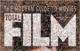
Total FILM had also altered their name fitting with the concept of the film, 'The Social Network'. They did this by cleverly merging a large quantity of profile images to make up the Total FILM logo.
Tron Legacy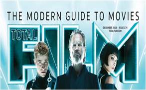
As 'Tron Legacy' is a futuristic film, a 3D effect was applied to the Total FILM logo. But what is interesting about the logo is that a hint of the setting can be seen within the lettering. This is interesting because it does not draw a lot of attention away from the main characters displayed but allows a sneak peak at the location in which 'Tron Legacy' is set.
|
Empire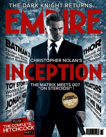
|
Total Film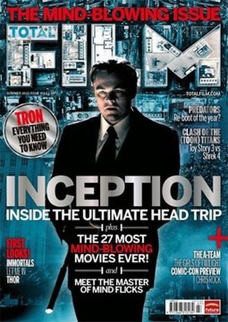
|
Looking at these front magazine covers of 'Inception', comparisons can be made by Empire and Total FILM according to layout, text and main character's posture and positioning.
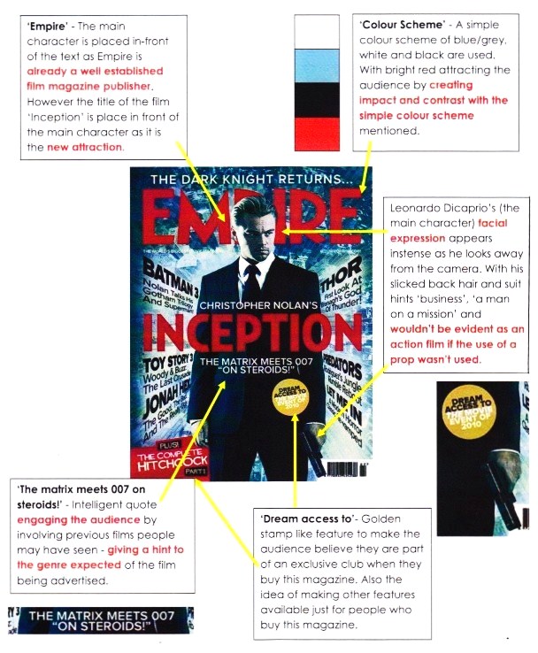
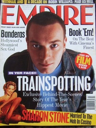
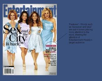
Trainspotting (1996)In relation to the construction of our teaser film trailer both 'Trainspotting' and 'Inception' are similar. 'Inception' with their storyline focus on the mind and inspirational slow motion bathtub scene, and 'Trainspotting' with their strong and persistent drug use. Both of these films had been issued on the front cover of 'Empire'. Although 'Trainspotting' was published in the earlier ages of Empire, many features stay the same. For example, the stamp feature exclusive to readers of Empire and the title of the film being in the centre of the page drawing a large amount of attention.
Typical codes and conventions to take on board for our magazine:
|
|
Design
|
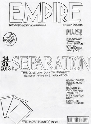
We decided to design a magazine layout sticking to the conventions of how magazines of Empire display a film on their front cover. This was achieved through adding Empire's website to the front cover and usual slogan ' The world's biggest movie magazine'.
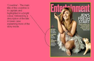
Statements such as 'Find out what triggers the stars addiction' was included, hinting the narrative of our film to the audience. Cover lines were also added stating the exclusive content inside this months magazine. They were kept short and punchy sticking to the codes and conventions. The content of the cover lines involve references of recent and upcoming films such as 'Twilight Breaking Dawn: Part 2' and James Bond 'Skyfall'. Referencing to mainstream films that people recognise brings in a mass audience therefore bringing in more attention to our film displayed. We also added an exclusive feature for the audience of Empire by including free posters of our film 'Separation'. This feature will also help differentiate Empire with other magazines as this feature is only available for Empire customers. |
Potential images for magazine
|
|
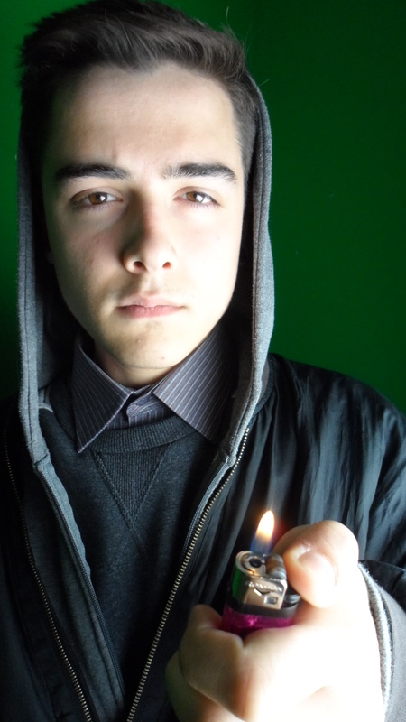

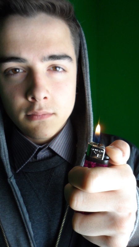
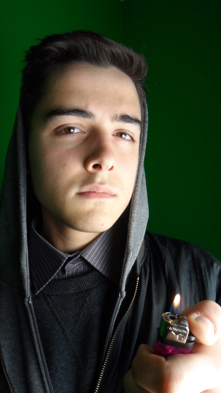
We photographed some images we could use for Empire's magazine cover using the same costume and prop in the scenes of drug use as our trailer. We took close-up images using the lighter to highlight the area near the eye. This was decided due to the striking image of the eye in the beginning of the teaser trailer. From looking at the images gathered we were not entirely satisfied, it felt as if not enough effort was put in therefore producing an image which would not strike an audience as a new and upcoming film different to those already established.
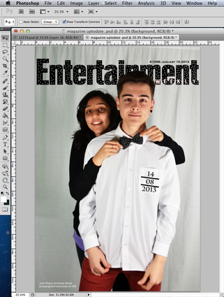
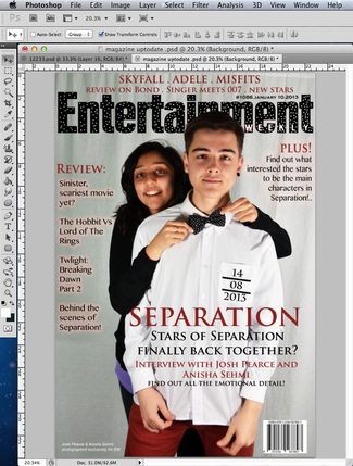
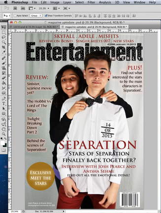
Entertainment Weekly
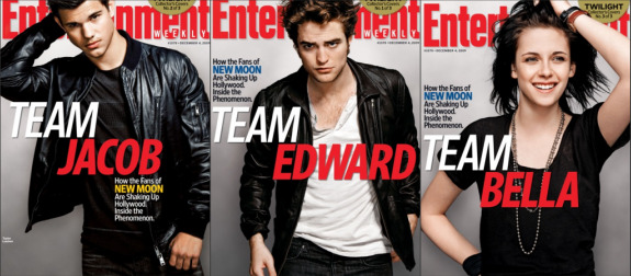
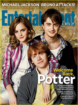
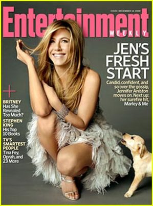
Entertainment weekly played on the concept of 'Twilight Teams' enabling them to create three covers for 'Twilight'. This allows the audience to interact with the magazine as they are able to choose which magazine they want to buy. It also may increase sales as costumers may want to collect all three magazines as part of a collection simply due to a change of cover.
|
|
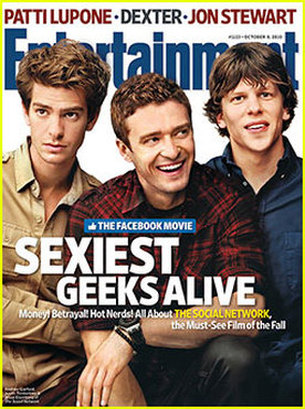
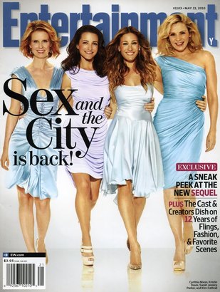
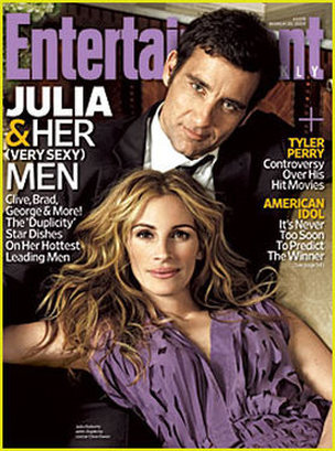
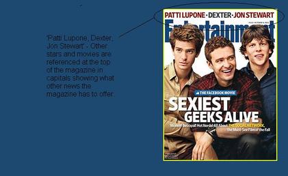
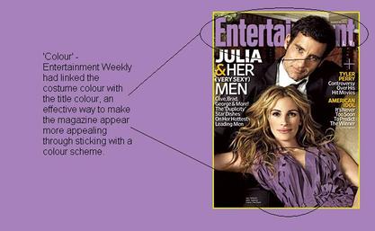
These other covers of Entertainment Weekly reveal very little about the films narrative compared to magazines such as Empire and Total Film. Entertainment Weekly focuses on the actors who play the characters of the film instead. The vibe given off by the covers of this magazine are relaxed, fun and welcoming; created by colour, positioning and facial expressions. Bright yellow, light blue, pink and purples are used to create this friendly environment which many of entertainment weekly's audience may be drawn too.
All of the magazine covers shown have no dominant main character positioned in the centre of the film. Despite one of the covers which features 'Jennifer Aniston' in the centre with a puppy placed on the side of her. The use of the puppy adds softness, and a sense of warmth to the image whilst intelligently hinting the narrative of the film 'Marley and Me'. The other film magazine covers however, have more than one actor/actress 'cuddled up' together showing a relationship in a fun and welcoming environment.
When it came to choosing the right magazine, overall we thought that Empire was too mainstream for our film due to our group wanting a more welcoming and humble approach to a film that is not as well recognised. This approach will enable our audience to relate to the actors not just the characters. As the characters are difficult to relate to as they are very troubled individuals. And so from getting to know the stars behind 'Separation' they will be interested to know how these people play such complicated characters, therefore be interested in what the film itself has to offer. And for that very same reason we decided to switch to Entertainment Weekly.
Elements of a magazine
|
|
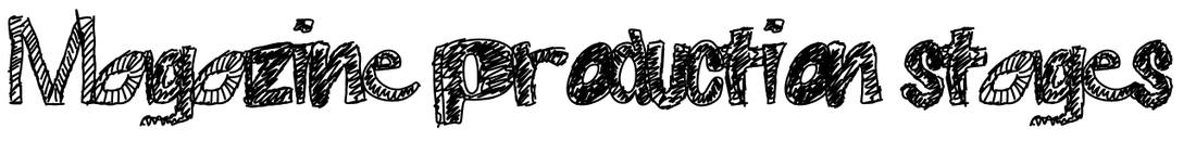
Images for Entertainment Weekly Magazine:
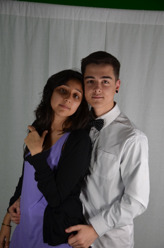
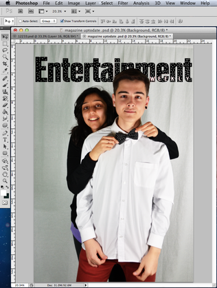
We had two approaches when it came to photographing for the magazine. The first being photographed as the characters of 'Separation', the second being photographed as the actors who play the characters of 'Separation'.
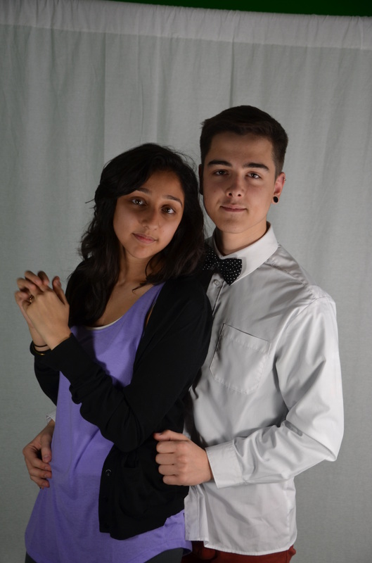
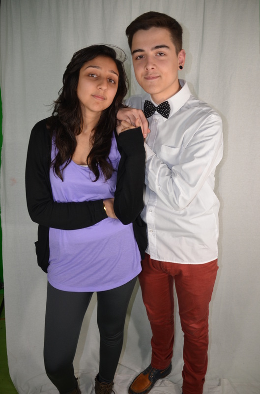
Photographed as the characters:
This was done to reflect the serious relationship the characters of 'Separation' have with one another. Conveying this emotion onto the magazine links with the emotion displayed in the teaser trailer. It was also done to open our options when choosing the right image to use for Entertainment Weekly magazine.
|
|
|
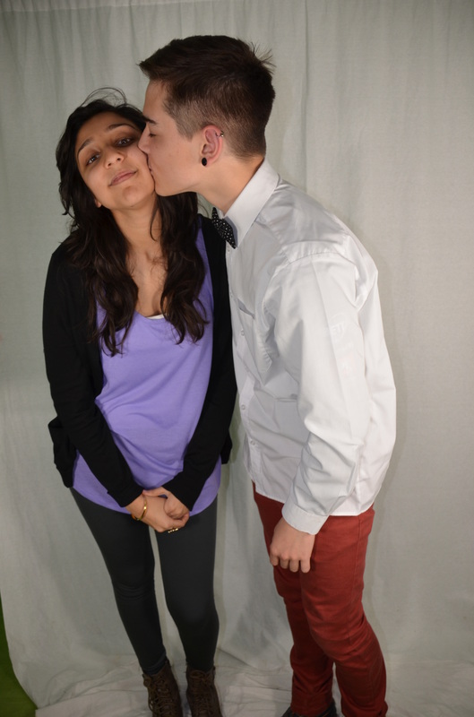
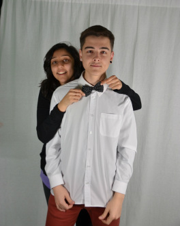
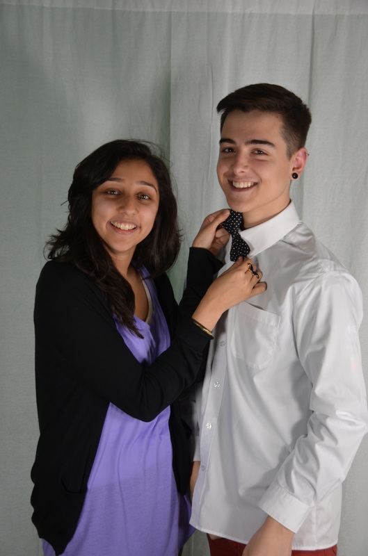
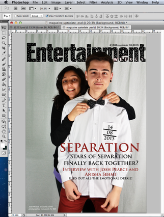
Photographed as themselves (the stars):
Moving away from the typical, we experimented with having fun with the actors themselves. From adding a twist to our title ('Separation') we showed through the images how our actors are not separated, they are very much together. Our research of Entertainment Weekly also show how the stars displayed on the front cover are never too serious themselves. Entertainment Weekly tends to have fun with the stars who feature on the front cover dropping hints to the narrative, giving very little away therefore intriguing their audience to find out more.
|
|
|
|
|
